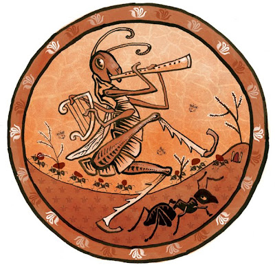
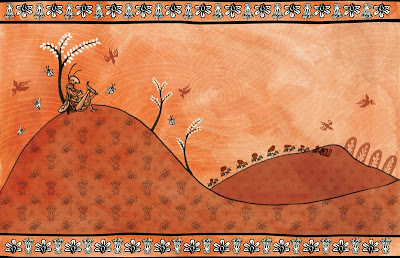
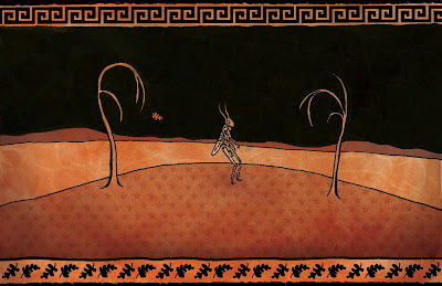
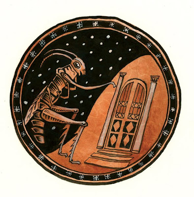
This is a series I did for work (it's for an elementary school reader-book for the Core Knowledge Foundation). The story is "The Grasshopper & the Ants," and I thought it would be fun to show the process I used.
My first step is to carefully read the story and write out some of the details I need to be sure to include in order to be faithful to the text. Next, I looked for pictures of grasshoppers and ants, and began to sketch them roughly. I didn't really want these illustrations to be realistic, but I looked for the basic shapes to communicate "grasshopper" and "ant."
Because the story is from Aesop, I decided it would be interesting to create images in the style of ancient Greek
kraters, so i also found reference images of Greek art.
Here are my final thumbnail sketches and notes:
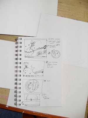
When I'm doing a sequential series of images for a story, it's important to me to establish a kind of rhythm where one image flows naturally into the next. I decided that alternating between round and rectangular formats would provide some variety and symmetry. Also, the first and last images (the round ones) would be close-up, while the middle two (the rectangular formats) would be more of a panoramic far-away view. I wanted the biggest contrast to come halfway through the story, where the grasshopper sees the blossoms and life of spring and summer give way to the bleak barrenness of autumn and winter, so I chose to switch suddenly to a black sky at that moment.
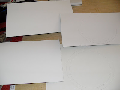
Having planned this out, I began to prepare my materials. I used illustration boards. Here they are with shapes ready to paint:
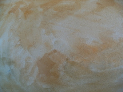
Next, I painted the shapes with a brown-orange tone to recreate the background color of the
kraters. I used gouache--cadmium orange, phthalo blue, burnt sienna and lots of water. I wanted a very uneven, antique-looking texture, so I let the paint dry in puddles without worrying about a smooth surface.
After the paint was dry, I sketched the drawings with pencil, based on my thumbnail sketches (from here on out, I'm going to follow one image to completion--the others followed a similar pattern). After the drawings were in place, I began inking them--I used a brush and India ink.
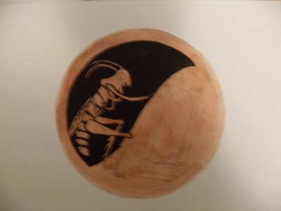
I finished inking the drawing, using a mechanical pen for a few of the finer details, like some of the patterns on the door.
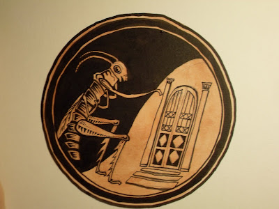
I added the white tones with gesso. At this point, I also darkened my sienna-orange tone in a few areas, to model the shapes and add a bit of form (not too much, though, since these are supposed to be pretty flat).
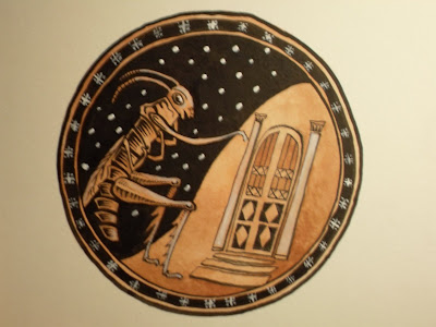
Finally, I scanned the drawing and added a cracked texture in Photoshop (I keep a folder of textures--many are photos I take of things near my home; some are from Google image searches).

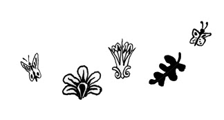
On some of the other images, I created additional small drawings of flowers, butterflies, leaves, etc. I scanned these to create patterns for backgrounds and borders in Photoshop.
Hopefully this has been interesting. I enjoyed creating these illustrations and exploring a different style.

Post Script:
Here is another quick one I did for my own amusement. It's on the back of a manilla envelope, so I skipped the background-coloring step.


 This is a series I did for work (it's for an elementary school reader-book for the Core Knowledge Foundation). The story is "The Grasshopper & the Ants," and I thought it would be fun to show the process I used.
My first step is to carefully read the story and write out some of the details I need to be sure to include in order to be faithful to the text. Next, I looked for pictures of grasshoppers and ants, and began to sketch them roughly. I didn't really want these illustrations to be realistic, but I looked for the basic shapes to communicate "grasshopper" and "ant."
Because the story is from Aesop, I decided it would be interesting to create images in the style of ancient Greek kraters, so i also found reference images of Greek art.
Here are my final thumbnail sketches and notes:
 When I'm doing a sequential series of images for a story, it's important to me to establish a kind of rhythm where one image flows naturally into the next. I decided that alternating between round and rectangular formats would provide some variety and symmetry. Also, the first and last images (the round ones) would be close-up, while the middle two (the rectangular formats) would be more of a panoramic far-away view. I wanted the biggest contrast to come halfway through the story, where the grasshopper sees the blossoms and life of spring and summer give way to the bleak barrenness of autumn and winter, so I chose to switch suddenly to a black sky at that moment.
Having planned this out, I began to prepare my materials. I used illustration boards. Here they are with shapes ready to paint:
 Next, I painted the shapes with a brown-orange tone to recreate the background color of the kraters. I used gouache--cadmium orange, phthalo blue, burnt sienna and lots of water. I wanted a very uneven, antique-looking texture, so I let the paint dry in puddles without worrying about a smooth surface.
 After the paint was dry, I sketched the drawings with pencil, based on my thumbnail sketches (from here on out, I'm going to follow one image to completion--the others followed a similar pattern). After the drawings were in place, I began inking them--I used a brush and India ink.
 I finished inking the drawing, using a mechanical pen for a few of the finer details, like some of the patterns on the door.
 I added the white tones with gesso. At this point, I also darkened my sienna-orange tone in a few areas, to model the shapes and add a bit of form (not too much, though, since these are supposed to be pretty flat).
 Finally, I scanned the drawing and added a cracked texture in Photoshop (I keep a folder of textures--many are photos I take of things near my home; some are from Google image searches).
  On some of the other images, I created additional small drawings of flowers, butterflies, leaves, etc. I scanned these to create patterns for backgrounds and borders in Photoshop.
 Hopefully this has been interesting. I enjoyed creating these illustrations and exploring a different style.
 Post Script:
Here is another quick one I did for my own amusement. It's on the back of a manilla envelope, so I skipped the background-coloring step.


3 comments:
These are way cool.
Beautiful Steve... just beautiful.
Awesome idea Steve. I love the style.
Post a Comment